Studio role
UX strategy, information architecture, UX research, UI design, microcontent strategy, design system, usability testing and post-launch optimization.
Context
DICIO AI needed its website to better reflect the maturity of its product and its position as a technology company. The existing experience operated more like a digital brochure: long-form communication, weak hierarchy, heavy reading and a value proposition that was hard to understand quickly.
The business problem was clear: the site was not converting visitor interest into qualified leads with enough strength. For a company with complex products, the challenge was not only to look better, but to explain better, guide better and activate better.
Challenge
Turn a dense, low-converting site into a clear experience for understanding the product and generating leads.
Objective
The business objective was to increase the site ability to convert interest into qualified leads.
From an experience perspective, the objective was to reduce cognitive load and make the value proposition quickly understandable. From a product perspective, the goal was to organize complex capabilities into a clear narrative. From design, the focus was to build a modular, consistent interface prepared to iterate.
Approach
Research, microcontent-first architecture, modular UI, design system and post-launch optimization cycles.
Solution
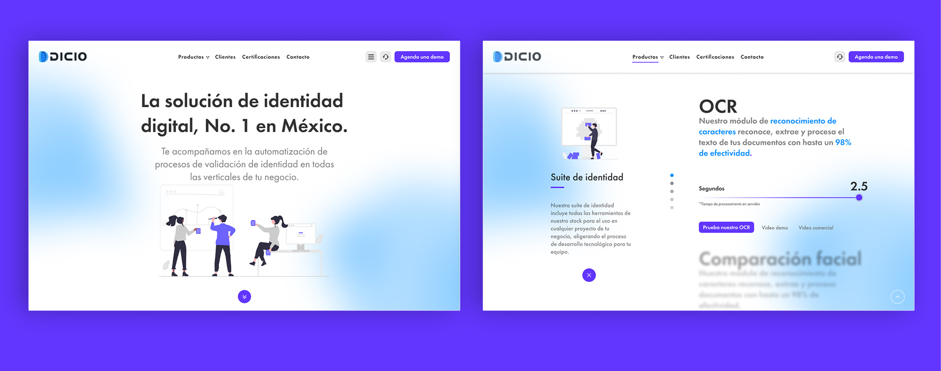
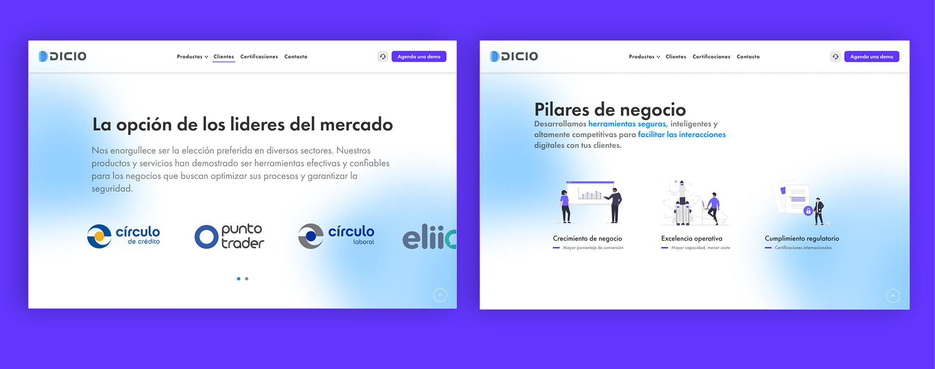
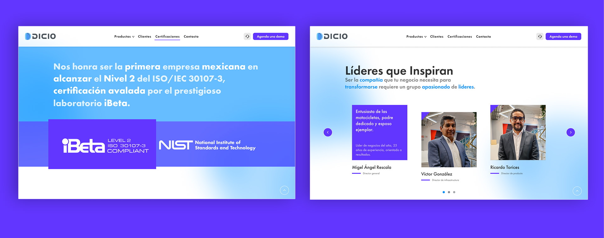
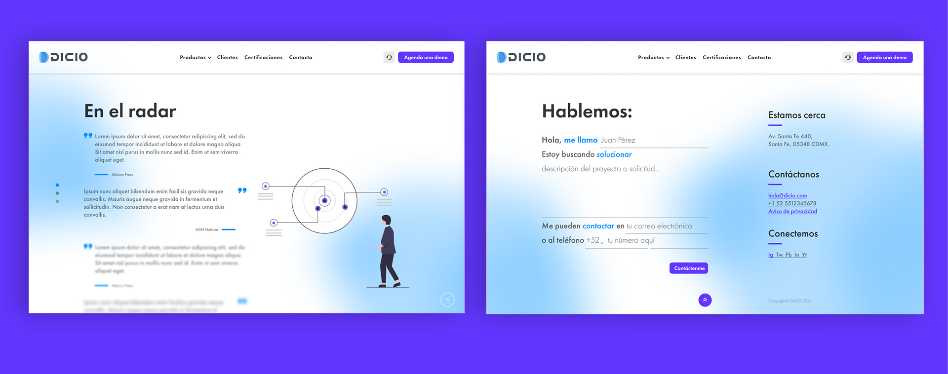
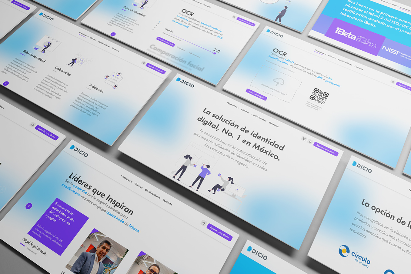
The solution reorganized the site around a microcontent-first architecture: scannable headlines, short messages, strong visual hierarchy and modules designed to explain value without forcing users to read long blocks.
The design turned the website into a modular system. Each section had to perform a specific job: explain a capability, reduce a doubt, direct an action or reinforce trust. The Figma design system documented components, patterns and visual rules to maintain consistency across design, content and implementation.
KPIs and success criteria
The main indicators were visitor-to-lead conversion, bounce rate, average time on site, reduction of descriptive text, perceived product clarity, CTA interaction and progress toward contact forms.
In this case, post-launch improvements were documented: +30% visitor-to-lead conversion during Q1, -40% bounce rate and -80% descriptive text.
Deliverables
The work delivered UX strategy, information architecture, narrative structure, microcopy, wireframes, final UI, Figma design system, component library, prototypes, usability testing, development handoff and guidelines for later optimization.
Results
The redesign turned the website into a clearer and more useful business channel. After launch, visitor-to-lead conversion grew 30% during the first quarter, bounce rate dropped 40% and descriptive text was reduced by 80%.
Beyond the metrics, the project established a more mature base for communicating complex products: less accumulated explanation, more direction, more clarity and a system prepared to keep growing.
Learnings
When a product is complex, the website should not explain everything at once. It should design a sequence of understanding: what it is, why it matters, how it works and what to do next.
Diagnosis and research
The process started with alignment workshops, benchmarking and user research to understand where clarity was being lost and what prevented visitors from moving forward. The key finding was that the content accumulated too much explanation and not enough direction.
The experience needed to stop describing the product like documentation and start organizing it as a journey: clear entry points, fast reading, visual cues and visible actions.
Microcontent-first architecture
The new architecture prioritized microcontent: short, scannable pieces connected to each other. Each block had to answer a specific user question and push the next decision without saturating the screen.
This approach reduced descriptive text, improved hierarchy and made AI and technology products easier to understand without losing depth.
Modular system
The site was designed as a system of reusable modules: heroes, product blocks, value arguments, CTAs, proof sections, cards and navigation patterns. The goal was for the site to grow without depending on isolated pages or new visual decisions for every update.
The Figma design system worked as the source of truth for design and engineering, helping maintain consistency and production speed.
Post-launch optimization
After launch, the work continued through testing cycles, behavior reading and adjustments to copy, hierarchy, modules and conversion points. The site was treated as a living product, not as a closed delivery.
This logic connected design with measurement: not only publishing a new version, but observing how it was understood, where users dropped off and which parts helped conversion.
Impact
The main impact was turning the site into a more active growth tool: a clearer experience for users, more useful for business and easier for the internal team to evolve.
The solution established a base for communicating complex technology with less noise, more intention and a structure capable of supporting new pages, products and campaigns.
Clarity is also a growth strategy: it reduces friction, accelerates understanding and converts better.DMX Studio
Gallery