Selected work.
A small set of projects, selected for the challenge. Each case tells the problem, approach, and outcome without filler.
A selection of real product, UX and AI systems work.
Challenge
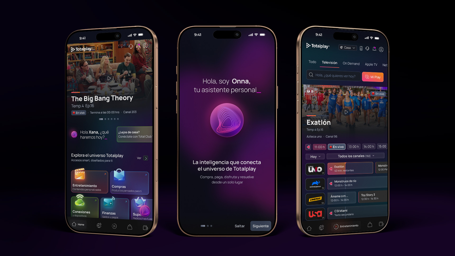
A 5M-client base with app usage concentrated in payment, invoices and Live TV.
Approach
A modular super app with an intelligent assistant, Live TV, finance and design system ready for development.
Solution
The solution organized the app around a modular experience, with the intelligent assistant as a transversal layer. Instead of presenting every function as an isolated section, the design connected intent, context and action. The UI was designed to support different layers of complexity: content consumption, telco self-service, financial operations, shopping, delivery and support. The design system unified patterns, components, states and visual hierarchies so the app could grow without breaking its base experience.
From transactional app to recurring digital ecosystem.DMX StudioView detail
Challenge
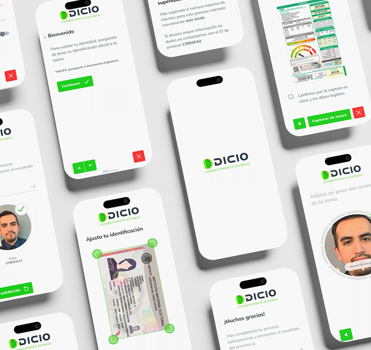
The challenge was to reduce drop-off and errors in a sensitive process without sacrificing security, compliance or trust. Existing flows could feel long, technical and unclear: users did not always understand what was being requested, why a capture failed or how much was left to finish. A poorly framed AI layer could make the experience even more opaque. The solution had to do the opposite: use automation, intelligent reading and contextual guidance so the system could explain, correct and support users before they failed.
Approach
The work started from pain points observed in real onboarding products: lengthy processes, failed captures, ambiguous instructions, uncertainty and operational costs when validations had to be repeated or reviewed manually. From that diagnosis, we designed a conversational flow built around one decision at a time. AI and automation were not treated as isolated features, but as a transversal layer to guide, validate, auto-fill and recover the flow when something went wrong.
Solution
The solution transformed onboarding into an AI-guided experience: the system asks for one action at a time, explains context through clear microcopy and uses capture signals to guide users in real time. OCR reduces manual input and changes the user role: they stop transcribing data and become supervisors of the detected information. Smart capture helps prevent errors before submission, with guidance around light, distance, position and stability. The PWA removes the friction of installing an app and lets the flow live on any device. The visual and component system was designed to scale: conversation patterns, states, validations, errors, confirmations and components were documented to support new onboarding variants without rebuilding the base experience.
The best onboarding does not ask for patience: it guides, validates and corrects before the user fails.DMX StudioView detail
Challenge
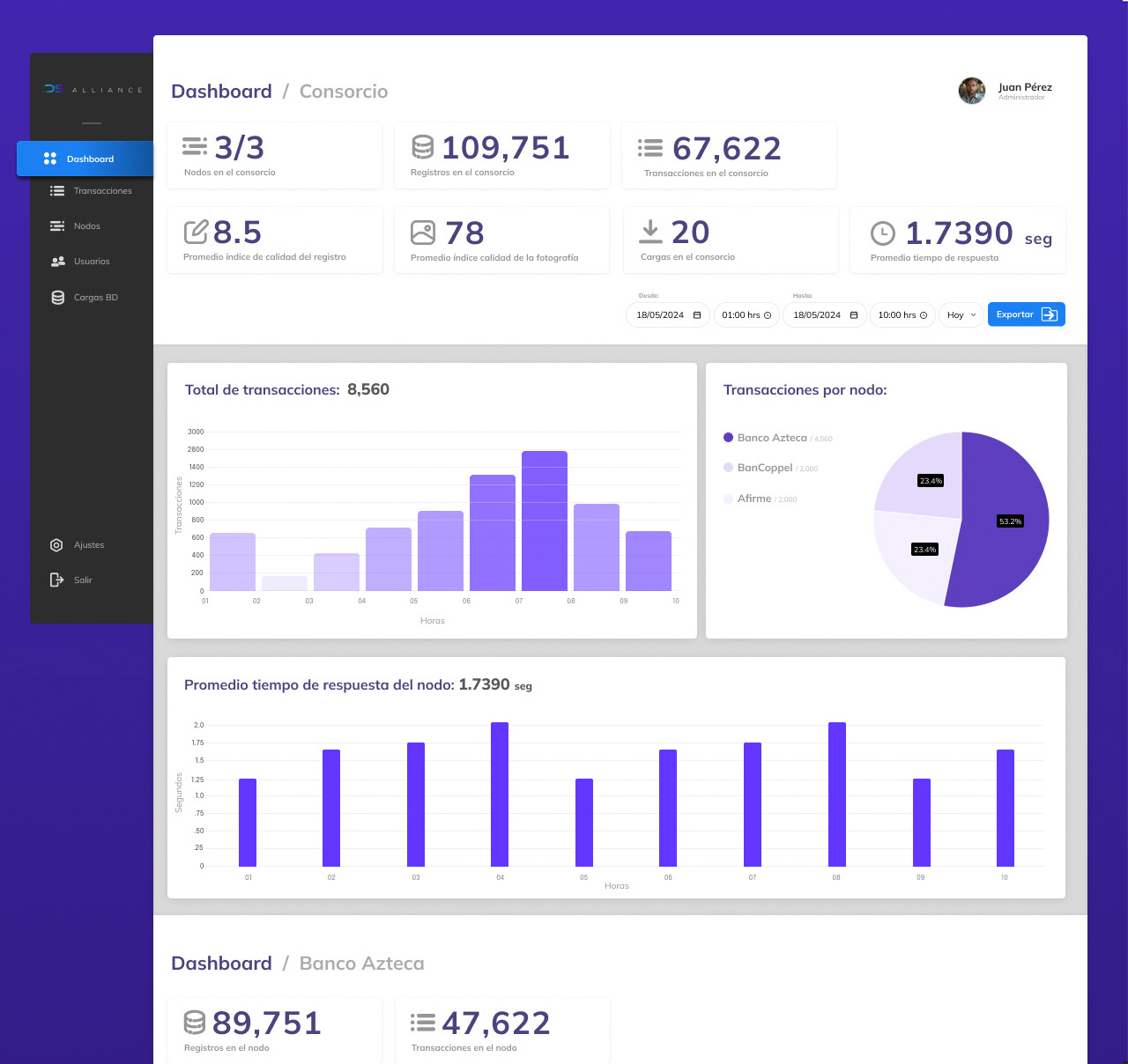
The challenge was not just to design a dashboard. The platform had to translate blockchain + AI processes into actionable information for internal teams, banks and clients, while maintaining traceability, trust and operational clarity. There was a natural tension between technical depth and human readability: showing too much could overload the interface; showing too little could hide the evidence needed to audit, understand status and make decisions. The solution had to provide visibility without noise.
Approach
We worked with the client through an initial discovery and validation stage: workshops, flow review, actor analysis, definition of critical information and criteria to understand whether the product solved a real problem for operational users and clients. From that foundation, the process evolved into UX/UI: information architecture, journeys, wireframes, prototypes and visual system. Each decision aimed to organize complex data into readable layers: executive overview, operational detail, process traceability, node status and enough evidence for auditability.
Solution
The solution was an administration platform where technology becomes visible in a useful way. The dashboard organizes KPIs, statuses, nodes, transactions and validation signals so teams can understand what is happening, detect anomalies and operate with greater confidence. AI and blockchain do not appear as decorative claims: they work as processes with signals, statuses and evidence. The interface lets users move from a general overview into deeper layers without losing context, using visual hierarchy, readable tables, clear indicators and consistent patterns for operational reading.
Trust is not designed by hiding complexity, but by making visible what people need in order to decide.DMX StudioView detail
Challenge
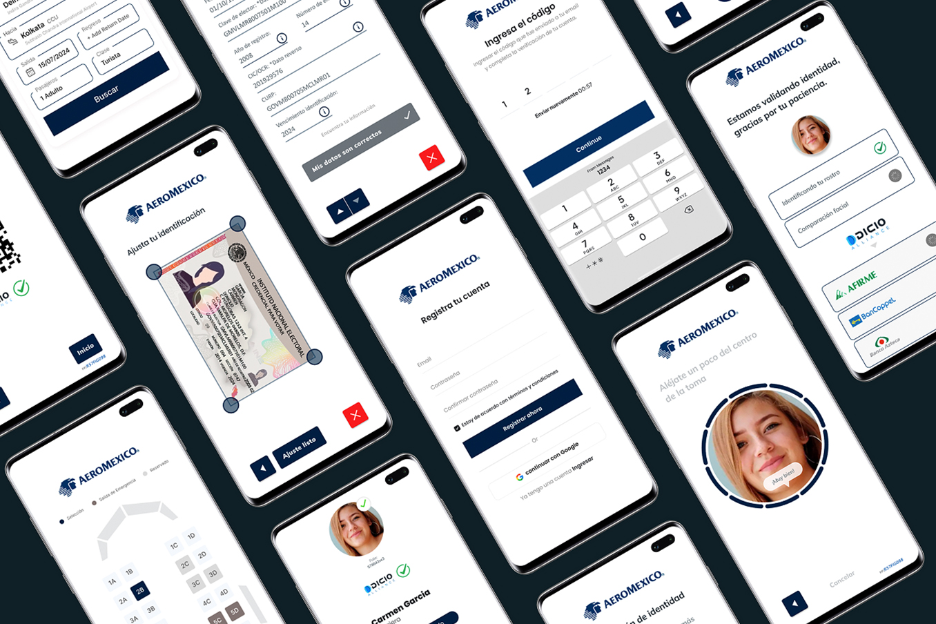
Design a contactless biometric journey connecting purchase, check-in, lounge and boarding without breaking trust.
Approach
Workshops, research, journey architecture, prototypes, design system and testing to validate the POC.
Solution
The solution framed passenger identity as the connective layer of the travel journey. Instead of treating biometrics as an isolated screen, the system integrated it as an authentication layer distributed across critical moments. The experience was designed to explain each step, request consent clearly, reduce uncertainty and keep process status visible. The visual and component system organized screens, states, messages and validation points so the pilot could be tested as a coherent end-to-end experience.
A contactless journey is not designed by removing steps, but by making identity, context and trust move together.DMX StudioView detail
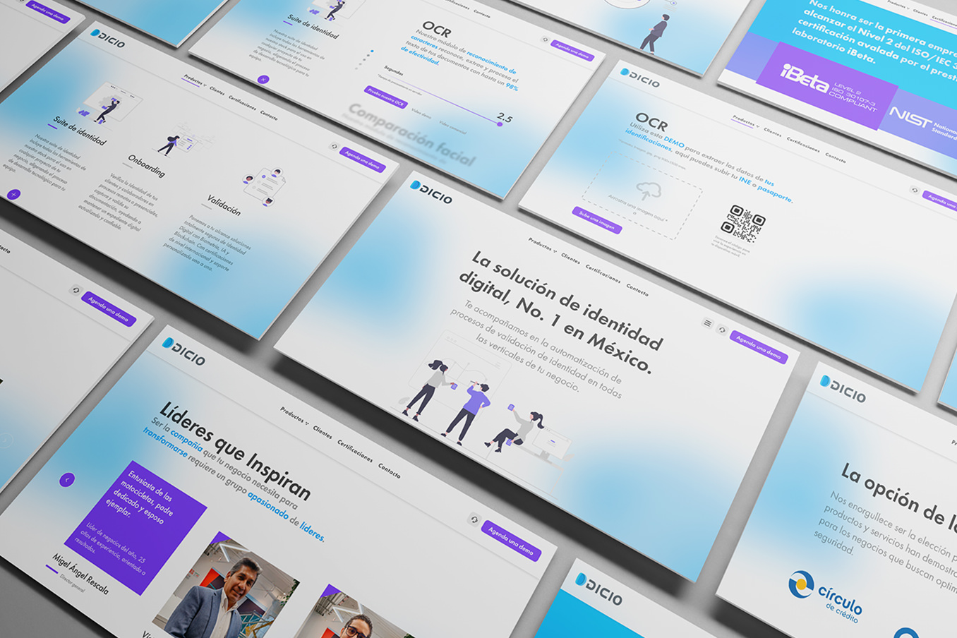
Challenge
Turn a dense, low-converting site into a clear experience for understanding the product and generating leads.
Approach
Research, microcontent-first architecture, modular UI, design system and post-launch optimization cycles.
Solution
The solution reorganized the site around a microcontent-first architecture: scannable headlines, short messages, strong visual hierarchy and modules designed to explain value without forcing users to read long blocks. The design turned the website into a modular system. Each section had to perform a specific job: explain a capability, reduce a doubt, direct an action or reinforce trust. The Figma design system documented components, patterns and visual rules to maintain consistency across design, content and implementation.
Clarity is also a growth strategy: it reduces friction, accelerates understanding and converts better.DMX StudioView detail